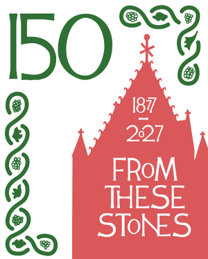

The Program Year theme for 2026-27 is From These Stones. I invite you here to my thoughts about the look and feel of the year’s branding and logo.
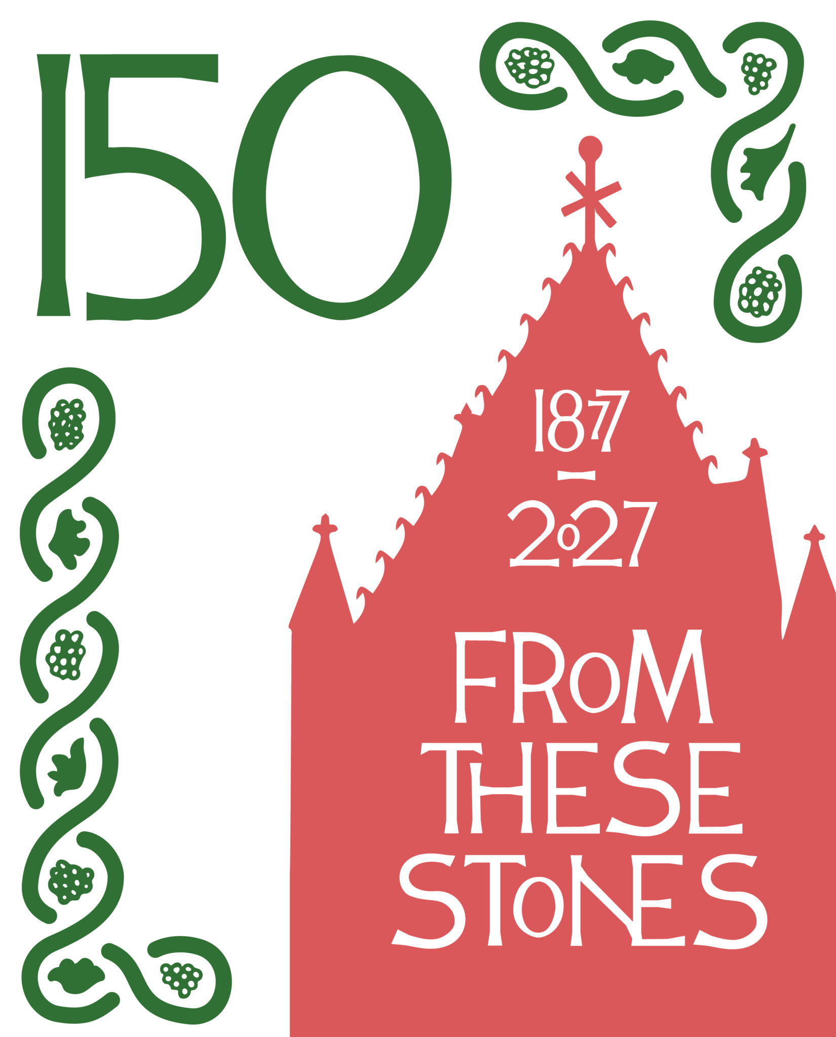 For the logo, I wanted the size ratio of a postage stamp because of the ‘from’ in From These Stones, and to bring to mind stamps themselves as fascinating little pieces of affordable, functional, and beautiful design. One afternoon in May, 2026, I attended the World Stamp Show, right here in Boston, and took note of the placement and sizes of type, as well as the strong graphic break-up of the space to create visually striking pieces on the final envelopes, on the thumbnail-sized stamps and postmarks from 100+ years ago, from all over the world.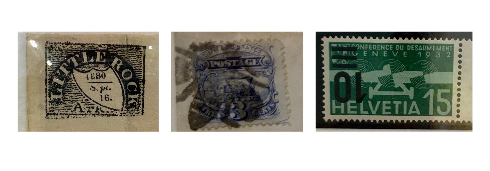
Trinity is a very human place — just think of all the folks who have sat in our pews over the last 150 years, or prior to that in our earlier buildings on Summer Street. The custom typeface for the yearly theme, built off of the letters in the Chancel, reflects the imperfections and charms of human craftsmanship. The evolution of the ideas held in that art and design, passed and dynamic from person to person over time, is part of a human story; no algorithm required.
I love how sometimes two letters merge into a new character, or the occasional smaller letter shows up to fit the phrase into the available space. Just like someone might scoot over in a pew for a fellow soul, the characters are making room for each other — see the CH combination, or the EA in Leadership:
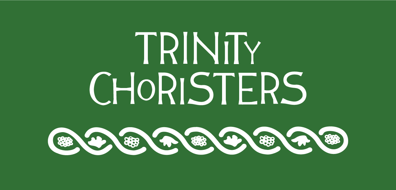
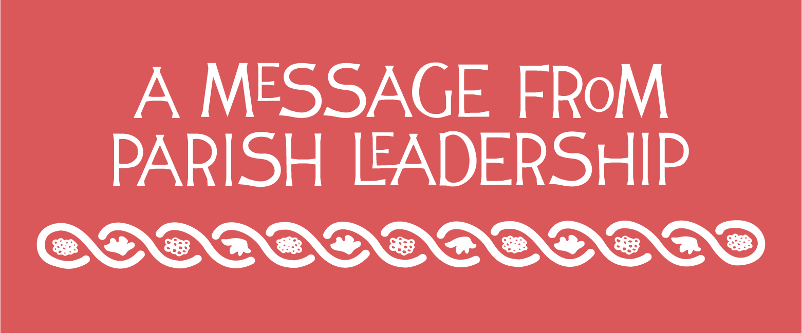
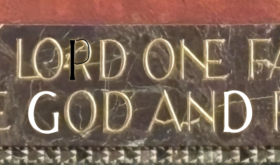 The functional typeface was created by tracing over images of the existing letters with the pen tool in Adobe Illustrator, and then imagining what numbers and punctuation might look like based on the forms in the existing alphabet in the Chancel, while being mindful of legibility.
 There is a shift, too, from the precise and geometric forms of the last few years’ branding to this year’s playful, crooked shapes; another friendly expression of human labor.
The church silhouette with the years 1877-2027 is these — this specific place! In the Fall 2026 mailer, I’ve echoed the same slope angle of the roof silhouette on the 150 events and will keep that angle in mind as layout opportunities arise over the year.

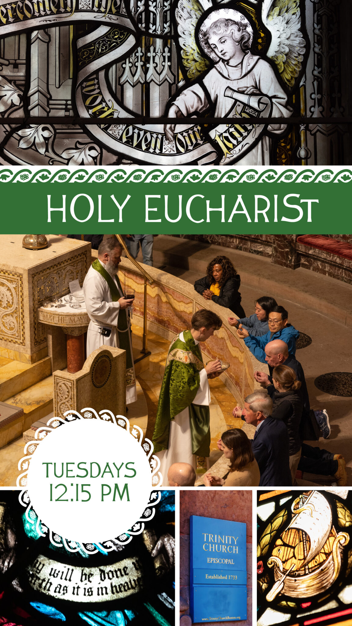 The border is taken pretty directly from one of the stones on the Broad Step near the Eagle Lectern. All of those stone carvings have individual, unique borders; I liked the one we are using for its relative symmetry and hope that the curving shapes of vines, leaves, and bunches of grapes, give a pleasant and charming contrast to the sharper angles of the type, while still being recognizable as Trinity’s own. The last program year’s gg-heart border was so versatile; I was excited to create a new one for this program year and we are already putting it to work in various graphics and signage.
In previous years, the colors have changed with the liturgical seasons, but this year begins a shift to standard colors for the program year. Inspiration is taken ‘from these stones’ – the greens of the chancel walls, and the William Morris windows, the red of the columns and other features of the interior.
Logos, colors, and type work together to tell a kind of story. Here, Trinity is telling our story — about a beautiful community stamped/imprinted with God’s love, and sending forth that love From These Stones into the city and beyond.